


How To Read Market Updates
Disclaimer: Every market update reflects the opinion of Retire By Investing based on the date in the title. Market updates are not financial advice. Please seek a licensed professional before investing or trading. We are not liable for any decisions you make based on our opinion.
Explaining the Chart

Candle sticks
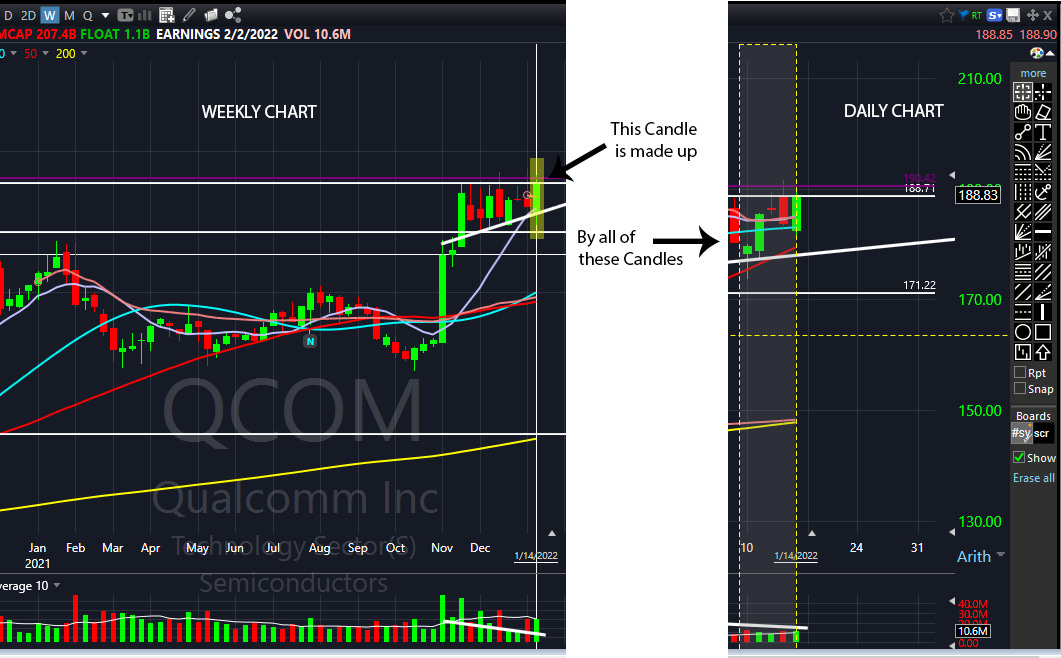
Candle sticks are important because they represent price movement in a minute, hour, day, week, or month. Depending on the timeframe that you’re on (in this case, we go by a weekly chart), you can dive into deeper detail. A better understanding of this is to look at your own hand. On the macro level you can see it’s a hand, but on the mid-level you know there are layers of skin, muscle, fat, that make up the hand, and what makes up those parts, in a micro-level, are the cells that are all put together.
Green/Red Candles
Depending on the timeframe, these candles can be red or green. Red means that the price decreased for that timeframe and green would mean that the price increased. You may see other investors use charts and have different colors, but the important takeaway is to know if the price closed red or green for the day.
OHLC
Open, High, Low, and Close. The most important part of these candles is the open and the close. The open and close will primarily make up a green or a red candle in relation to the price. The low and the high just tell you what happened within the designated timeframe.
Wicks
The low and the high of a candle stick make up the “Wick”, which is a very thin line that travels through price. During volatile days the price can dip or rise to a certain level, but close in totally different price at the end of the day.
Patterns
Overtime candle sticks can make up certain patterns. These patterns can tell you about supply, demand, and human behavior in the markets. These patterns can tell you when the market is shifting from an uptrend to a downtrend and vice versa. Fortunately, you will not have to worry about this because we will point out the patterns in the chart.
Support
Imagine being on the third floor of an apartment, breaking through the floor you’re on, landing on the second floor, and stabilizing on the second floor. That is the visual representation of price action when it hits a support. When price action hits a support, or when we say it, it means that the price has hit an area that is hard to break. We expect that price to hold depending on market conditions, but that doesn’t necessarily mean it will.
Resistance
Imagine trying to push the ceiling of your car, it would be pretty hard right? Now think of price action trying to hit a ceiling of the car – it will most likely fail. It doesn’t mean that overtime it’ll never break the ceiling. It just means that the price may not advance for a while, but when it does there is nothing blocking the price from going higher.
Terminology
Bull - Investors who believe the stock will go up.
Long – Investors who have a position and profit by the stock going up.
Bear - Investors who believe the stock will go down.
Short – Investors who have a position and profit by the stock going down.
What do we cover?
We cover Cryptocurrency (Digital Assets) and Stocks (Equities). We believe the majority of people follow these two topics when it comes to investing. Bitcoin is our main focus in Cryptocurrency because it has the longest history out of all the digital assets. We have shared our opinion on this asset, which can be seen here. As for equities, our focus is the NASDAQ (IXIC), which primarily includes growth stocks. We believe growth stocks bring in the highest return and use the NASDAQ as a marker for the general health of most stocks in the index.
Why a weekly timeframe?

Investors usually have longer time horizons than most people. Majority of Equities and Cryptocurrency will go through boom and bust cycles. Watching the market every single day isn’t going to change the decision if the NASDAQ or Bitcoin is going to fail or succeed. If you’re investing for the longer term then the weekly timeframe is going to reflect that in your decision. In our opinion, we believe that you should live your life and look at the market at the end of every single week. You don’t have to do it alone though. We’re here to help.
What do the colors represent – Explained in-depth.
These colors are going to mean more to you as you get more into investing. They may seem vague, but once you have the understanding through this article, you’ll appreciate it more.
The colors represent certain areas of support and resistance in relation to the probability of market direction (Please refer to the beginning of this article to clarify any terminology you do not understand). No one has a crystal ball that can tell us where the market is going, but we can make an educated guess based on price action. Price action is objective data that we interpret and put in probabilities. As an investor, you are always taking a probability or a chance that the price of a stock or crypto will increase or decrease. There are no absolutes in investing, and you will most likely lose money if you think this way.
In our market updates, the colors represent our opinion on the market direction based on historical price movement. It reflects our ideas on when we would most likely buy or sell, but that doesn’t necessarily mean we will. We understand that the market can be hard to navigate, and we want to help everyone understand the probabilities so they can hedge themselves against risk.


Share this post